What does the cockpit of your spaceship in Star Citizen have to do with a browser-based business simulation game like Prosperous Universe? Find out in this week’s unusually lengthy development log!
Martin
Once again, I ended up working on something that I hadn’t planned for. But to explain what exactly I was doing and why it needed to be done, I first need to elaborate a bit on some deeper design thoughts. So bear with me :)
If you’ve read the dev-log for the past few weeks you probably know that we have been working on a new UI for quite some time now. In typical computer games, the visual elements one would call “UI” usually only make up a small percentage of the overall visuals. Think of a HUD in a shooter or control widgets in a strategy game: They exist, they are important, but the general tone and atmosphere of the game is in huge part defined by the actual content and assets and not by these UI elements.
For Prosperous Universe, this is not the case. Since it is a browser-based game that’s first and foremost a business simulation, the UI makes up 95% of what a player will ever see of it. There are visual assets for some of the game’s content and there are very visual schematics like maps, but all in all, the UI is the game. As such, the UI of Prosperous Universe doesn’t only have to be functional: It plays a key role to achieve immersion. It needs to convey a lot of information about what the game world the player is trying to become a part of looks and feels like.
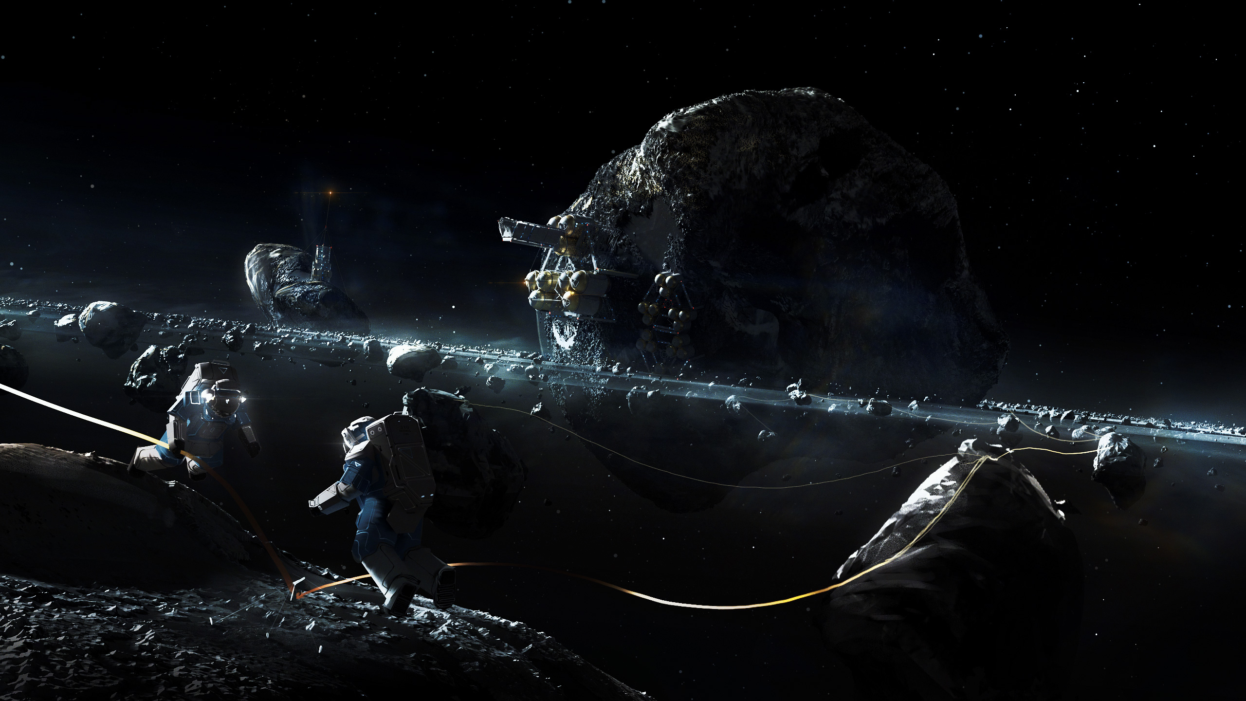
Think of it as the cockpit a player finds herself in when playing a game like Elite: Dangerous or Star Citizen: Even though it wouldn’t be strictly necessary for such a game to have physical cockpits - you could just as well display only a HUD - great effort is put into creating the illusion that you are actually sitting in a spaceship. It immerses you in the game because you can actually see your cockpit…it’s your interface to the world you are playing in.
Which brings us back to Prosperous Universe: We decided that the UI of PU is quite literally the interface to our game world. Just as the cockpit is the interface to your spaceship in Star Citizen, our UI is the interface to the trading system that all commerce in our game world is processed by. Consequently, this is a system for professionals, something that needs to convey the feeling of actually being a skilled trader in a world dominated by commerce. We want the UI itself to give the player a feeling of progression: The longer you play the game, the more familiar you will become with our UI and you will learn new tricks and shortcuts that allow you to use it faster or more efficiently. It will give you a certain sense of sophistication when you can just hack a quick command into a prompt* and a window comes up with exactly the kind of information you are looking for. Knowing elements of the game by their code, identifier or command makes you feel like you actually know the world.
So about 500 words into this article I can now finally tell you what I was working on this week: When a user does just that - enter a command to open a certain UI element - they often need to know the identifier of the object they are trying to view. While many objects have natural IDs that are easy to remember (like tickers for certain exchange rates or the codes of star systems), other objects don’t. For these cases we needed an alternative system that would allow unique, system-generated identifiers that can still be used directly by an experienced user. At the same time, our server systems should always return the expected results, even if the user enters only partial identifiers or unstable natural identifiers. This doesn’t sound too complicated, but it has implications for each and every system of the game, all the way from the database to the highest-level helper functions of the client. Due to this, I mostly spent defining requirements, gathering edge-cases and planning the implementation instead of actually working on this yet. This will be something I’ll have to do over the coming weeks.
Michi
This week I did the redesign of the inventory/material transfer. In our previous prototype players could move goods from ships to planetary settlements by opening a material transfer window. On the one side was the cargo hold of the ship on the other the planet’s inventory. Right between the two were the transfer controls. The player had to select a material on either side, then choose with the controls how much she wanted to transfer and click on a button. The redesign started with the same layout: two inventories next to each other and controls in the middle. I then decided to use drag and drop instead of the controls in the middle. But how can the user transfer a certain amount of materials and not just one or all?
The solution was to introduce “drag targets”, dynamic elements that are being shown whenever a drag starts. The labels on these targets indicate how much will be transferred. For example: one unit, half of what’s in stock, all or the maximum that the target store can accept. I was pretty happy with the result and showed it to Martin and he pointed out that having a single window to transfer things when we use drag and drop doesn’t make sense anymore. The players surely what to drag from one window to another and not open a window just for that purpose. So I scrapped the whole transfer window but kept the drag and drop functionality. The “drop targets” are now shown as an overlay over all open inventories that can accept the given materials, e.g. are at the same location and are not full.
This is just one example of how you start the week with a clear picture of what you’re going to implement and end up with a totally different solution in the end :)