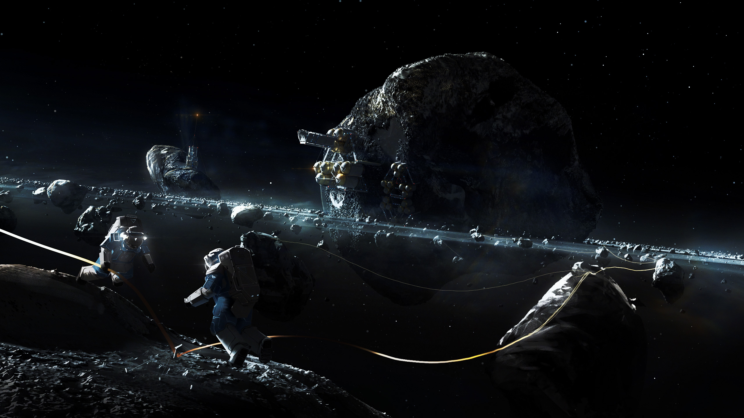
Sorry for releasing this issue of our development log so late, but we were busy polishing Prosperous Universe until the last minute. Not saying we’re crunching…just maybe working a tad more than usual. We really want to get that Alpha done, though!
Martin
I dealt with a diverse range of topics this week:
First, I continued where I left off last week and connected Prosperous Universe to our account management backend. This went surprisingly smoothly so I had more time left than originally planned.
That extra time was spent on something that I had been planning to do for weeks but never got around to: Rebuilding the “frame” of our UI. We’ve been talking about our tile-based UI on this blog quite a few times in the past, so you probably have a rough idea of what it looks like. Essentially, everything you can do and see in PU happens in a tile. So obviously, the more tiles you can fit on a single screen, the more you can do and see. I had this idea stuck in my head for ages now that I wanted to have the frame to be as slim as possible and to allow players to completely hide any parts of the frame they don’t need. I also wanted their preferences to be stored with each screen - a view of tiles a user can save - so whenever they switched to a different screen, the frame would still be configured the way they left it. This allows for maximum utilization of screen space and looks rather awesome in fullscreen mode with a multi-monitor setup. I hope to be able to show a photo of such a setup soon!
Last but not least, I took care of a few smaller issues that were bothering me but so far didn’t have as much priority as or main features, namely some design adjustments in our login and company registration process as well as a few helpers around commodity exchanges. At the moment, it is almost impossible for someone who has never seen PU before to do anything in the game, simply because they’d have no idea where to look. Obviously, this has to change before we can let external testers have a go at the soon-to-be-completed alpha version, so more of this “smaller stuff” will be dealt with over the coming weeks.
Michi
I am still working on minor issues and improvements that have been piling up over the past months of development. One particular thing is the state we display when a ship charges its faster-than-light engines. The flight model works like this:
If you want to send a ship to a distant star system, you select a route and how much reactor power you want to use and hit the send button. Right before the ship starts the actual flight to the next system it has to charge up its FTL engines and that can take a while (depending on what kind of engine you have).
Up until now the ship would have been listed as in transit from the moment you hit the button until it reaches the next system. The icon in the map would switch to indicate that the ship is in transit but it wouldn’t move because it is still charging. This was quite confusing, so I changed it. There is a separate icon now to represent the charging state and the list of ships will display it as well.
In my opinion these little details are essential for a good game. They help to keep the player in the suspension of disbelieve and indirectly explain the underlying game mechanics.

